Note
Go to the end to download the full example code.
Plot with Opacity#
Plot a mesh’s scalar array with an opacity_transfer_function
or opacity mapping based on a scalar array.
import pyvista as pv
from pyvista import examples
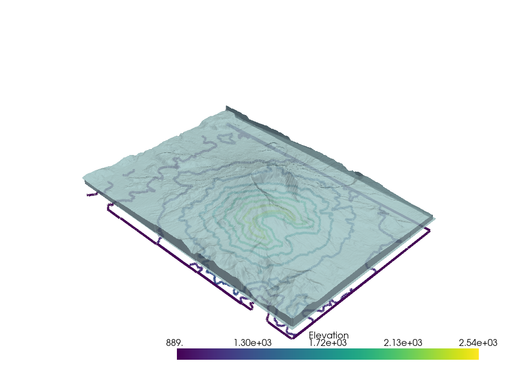
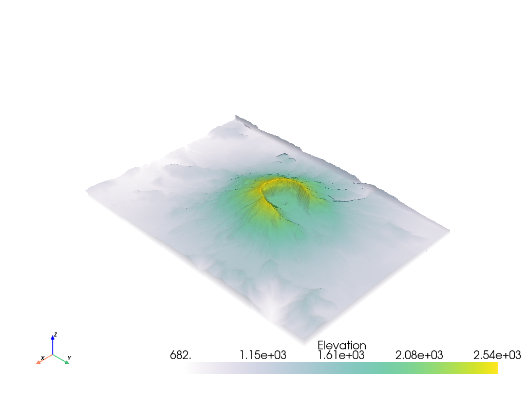
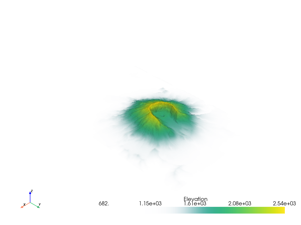
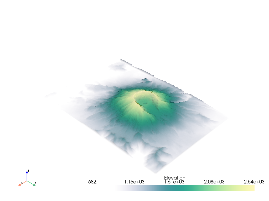
# Load St Helens DEM and warp the topography
image = examples.download_st_helens()
mesh = image.warp_by_scalar()
Global Value#
You can also apply a global opacity value to the mesh by passing a single float between 0 and 1 which would enable you to see objects behind the mesh:
pl = pv.Plotter()
pl.add_mesh(
    image.contour(),
    line_width=5,
)
pl.add_mesh(mesh, opacity=0.85, color=True)
pl.show()
Note that you can specify use_transparency=True to convert opacities to
transparencies in any of the following examples.
Transfer Functions#
It’s possible to apply an opacity mapping to any scalar array plotted. You can specify either a single static value to make the mesh transparent on all cells, or use a transfer function where the scalar array plotted is mapped to the opacity. We have several predefined transfer functions.
Opacity transfer functions are:
'linear': linearly vary (increase) opacity across the plotted scalar range from low to high'linear_r': linearly vary (increase) opacity across the plotted scalar range from high to low'geom': on a log scale, vary (increase) opacity across the plotted scalar range from low to high'geom_r': on a log scale, vary (increase) opacity across the plotted scalar range from high to low'sigmoid': vary (increase) opacity on a sigmoidal s-curve across the plotted scalar range from low to high'sigmoid_r': vary (increase) opacity on a sigmoidal s-curve across the plotted scalar range from high to low
It’s also possible to use your own transfer function that will be linearly mapped to the scalar array plotted. For example, we can create an opacity mapping as:
opacity = [0, 0.2, 0.9, 0.6, 0.3]
When given a minimized opacity mapping like that above, PyVista interpolates
it across a range of how many colors are shown when mapping the scalars.
Linear interpolation is used by default, but other kinds of interpolation
can be used if scipy is available.
Curious what that opacity transfer function looks like? You can fetch it:
# Have PyVista interpolate the transfer function
tf = pv.opacity_transfer_function(opacity, 256).astype(float) / 255.0

import matplotlib.pyplot as plt

plt.plot(tf)
plt.title('My Interpolated Opacity Transfer Function')
plt.ylabel('Opacity')
plt.xlabel('Index along scalar mapping')
plt.show()
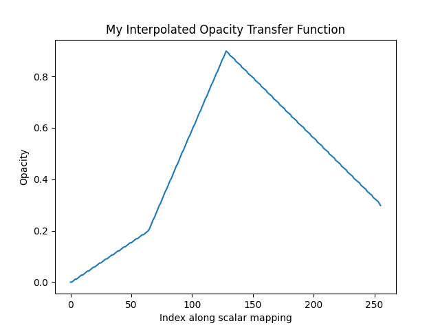
That opacity mapping will have an opacity of 0.0 at the minimum scalar range, a value or 0.9 at the middle of the scalar range, and a value of 0.3 at the maximum of the scalar range:
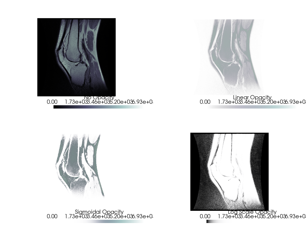
Opacity mapping is often useful when plotting DICOM images. For example, download the sample knee DICOM image:
knee = examples.download_knee()
And here we inspect the DICOM image with a few different opacity mappings:
pl = pv.Plotter(shape=(2, 2), border=False)

pl.add_mesh(knee, cmap='bone', scalar_bar_args={'title': 'No Opacity'})
pl.view_xy()

pl.subplot(0, 1)
pl.add_mesh(
    knee, cmap='bone', opacity='linear', scalar_bar_args={'title': 'Linear Opacity'}
)
pl.view_xy()

pl.subplot(1, 0)
pl.add_mesh(
    knee, cmap='bone', opacity='sigmoid', scalar_bar_args={'title': 'Sigmoidal Opacity'}
)
pl.view_xy()

pl.subplot(1, 1)
pl.add_mesh(
    knee, cmap='bone', opacity='geom_r', scalar_bar_args={'title': 'Log Scale Opacity'}
)
pl.view_xy()


pl.show()
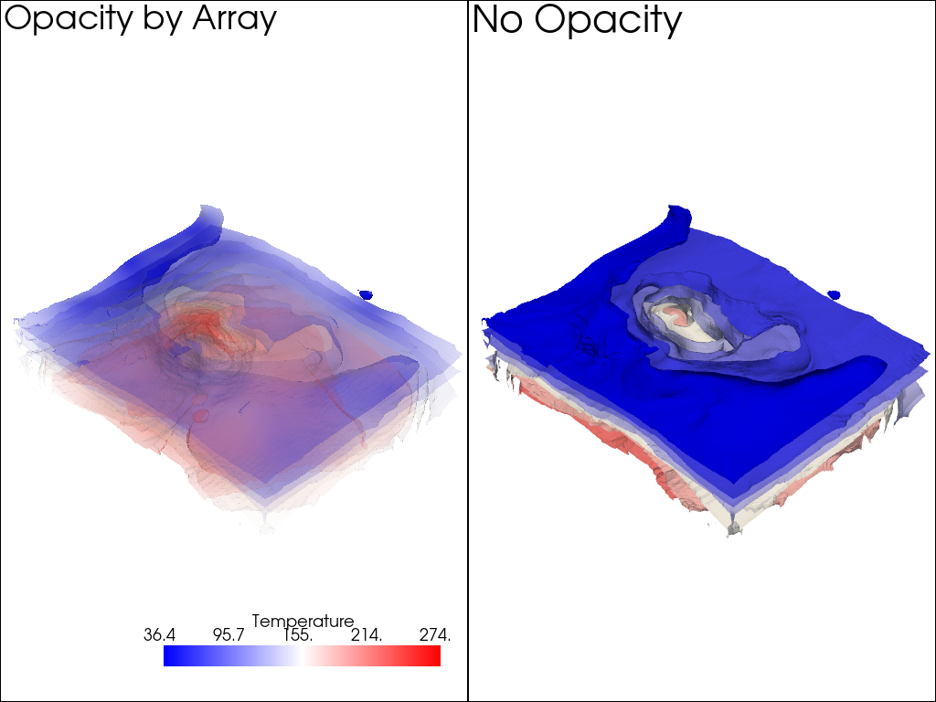
Opacity by Array#
You can also use a scalar array associated with the mesh to give each cell its own opacity/transparency value derived from a scalar field. For example, an uncertainty array from a modelling result could be used to hide regions of a mesh that are uncertain and highlight regions that are well resolved.
The following is a demonstration of plotting a mesh with colored values and using a second array to control the transparency of the mesh
model = examples.download_model_with_variance()
contours = model.contour(10, scalars='Temperature')
contours.array_names
['Temperature', 'Temperature_var']
Make sure to flag use_transparency=True since we want areas of high
variance to have high transparency.
Also, since the opacity array must be between 0 and 1, we normalize the temperature variance array by the maximum value. That way high variance will be completely transparent.
contours['Temperature_var'] /= contours['Temperature_var'].max()

pl = pv.Plotter(shape=(1, 2))

pl.subplot(0, 0)
pl.add_text('Opacity by Array')
pl.add_mesh(
    contours.copy(),
    scalars='Temperature',
    opacity='Temperature_var',
    use_transparency=True,
    cmap='bwr',
)

pl.subplot(0, 1)
pl.add_text('No Opacity')
pl.add_mesh(contours, scalars='Temperature', cmap='bwr')
pl.show()
Total running time of the script: (0 minutes 15.770 seconds)