注釈
Go to the end をクリックすると完全なサンプルコードをダウンロードできます.
チャートの基本#
この例では,さまざまなタイプのチャートをシーンに追加する方法を示しています.より複雑な例として,同じレンダラーで複数のチャートをオーバーレイとして組み合わせる方法は, チャートのオーバーレイ にあります.
from __future__ import annotations

import numpy as np
import pyvista as pv


rng = np.random.default_rng(
    1
)  # Seeded random number generator for consistent data generation
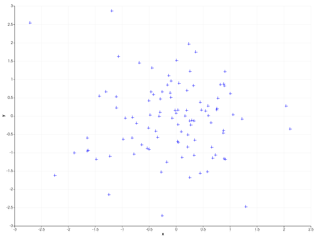
この例では、 scatter() を使用して、ランダムにサンプリングされた100個のデータポイントから2D散布図を作成する方法を示します。 デフォルトでは、プロットされたデータがすべて見えるように、チャートは自動的に軸のスケールを変更します。チャート上で右クリックすると、チャートのズームとパンを有効にすることができます。
x = rng.standard_normal(100)
y = rng.standard_normal(100)
chart = pv.Chart2D()
chart.scatter(x, y, size=10, style='+')
chart.show()
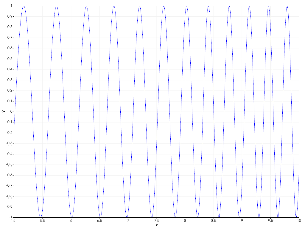
データ・ポイントを線で結ぶには、 line() を使って下の例のように2Dの折れ線プロットを作成することができる。また、カスタム軸範囲を指定することで、プロットされたデータに動的に 'zoom in' をかけることもできます。
x = np.linspace(0, 10, 1000)
y = np.sin(x**2)
chart = pv.Chart2D()
chart.line(x, y)
chart.x_range = [5, 10]  # Focus on the second half of the curve
chart.show()
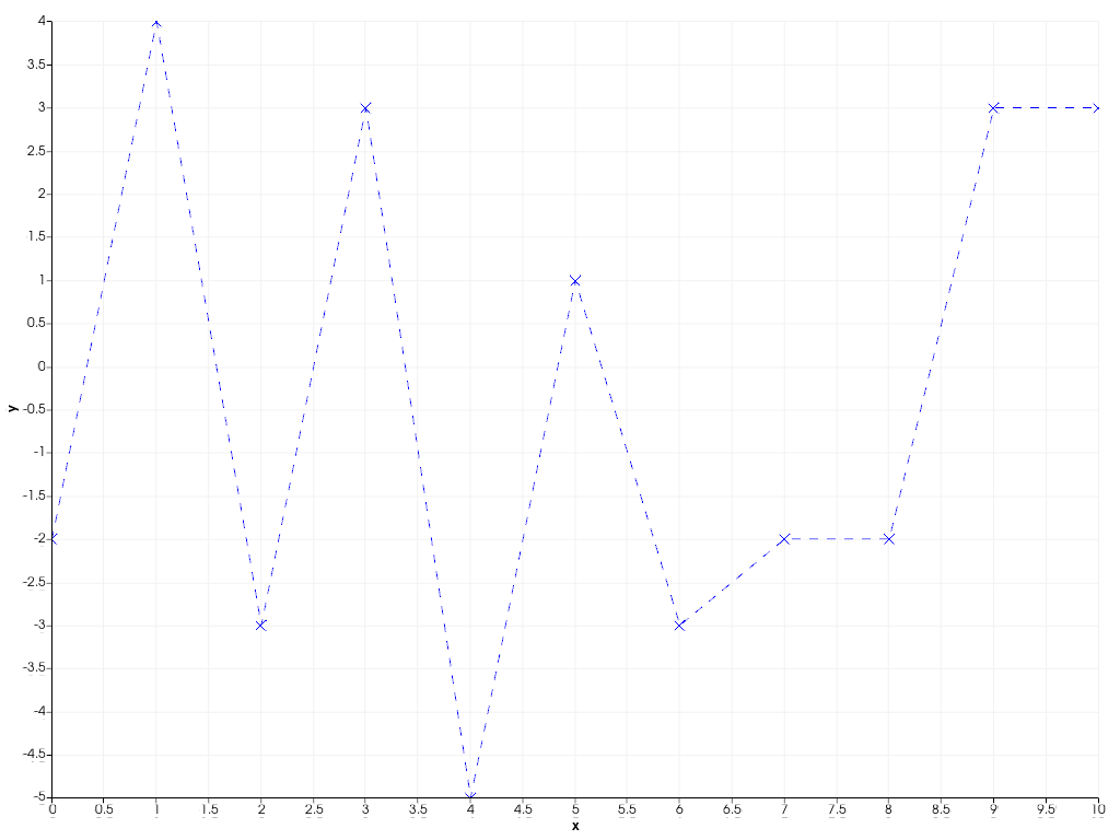
また、一般的な plot() 関数を使えば、散布図と折れ線グラフを簡単に組み合わせることができ、折れ線とマーカーの両方のスタイルを一度に指定することができます。
x = np.arange(11)
y = rng.integers(-5, 6, 11)
chart = pv.Chart2D()
chart.background_color = (0.5, 0.9, 0.5)  # Use custom background color for chart
chart.plot(x, y, 'x--b')  # Marker style 'x', striped line style '--', blue color 'b'
chart.show()
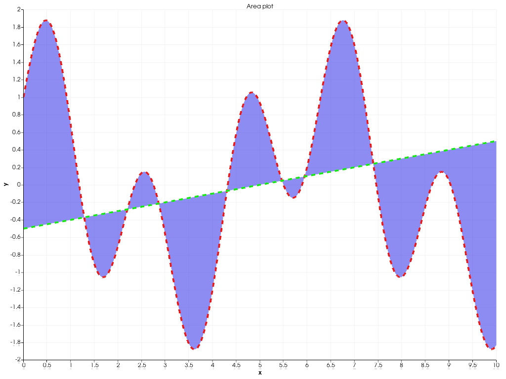
次の例では、 area() を使用して2つのポリラインの間に塗りつぶし領域を作成する方法を示しています。
x = np.linspace(0, 10, 1000)
y1 = np.cos(x) + np.sin(3 * x)
y2 = 0.1 * (x - 5)
chart = pv.Chart2D()
chart.area(x, y1, y2, color=(0.1, 0.1, 0.9, 0.5))
chart.line(x, y1, color=(0.9, 0.1, 0.1), width=4, style='--')
chart.line(x, y2, color=(0.1, 0.9, 0.1), width=4, style='--')
chart.title = 'Area plot'  # Set custom chart title
chart.show()
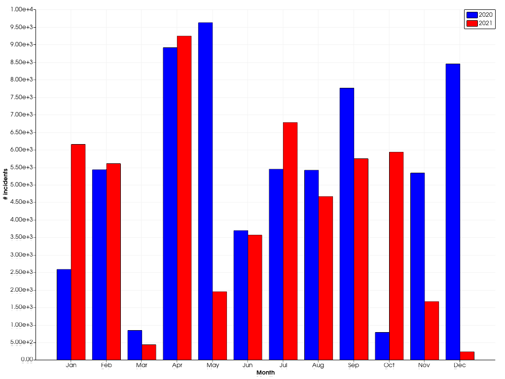
bar() を使った棒グラフもサポートされています。 複数の棒グラフが隣り合わせに配置されています。
x = np.arange(1, 13)
y1 = rng.integers(1e2, 1e4, 12)
y2 = rng.integers(1e2, 1e4, 12)
chart = pv.Chart2D()
chart.bar(x, y1, color='b', label='2020')
chart.bar(x, y2, color='r', label='2021')
chart.x_axis.tick_locations = x
chart.x_axis.tick_labels = [
    'Jan',
    'Feb',
    'Mar',
    'Apr',
    'May',
    'Jun',
    'Jul',
    'Aug',
    'Sep',
    'Oct',
    'Nov',
    'Dec',
]
chart.x_label = 'Month'
chart.y_axis.tick_labels = '2e'
chart.y_label = '# incidents'
chart.show()
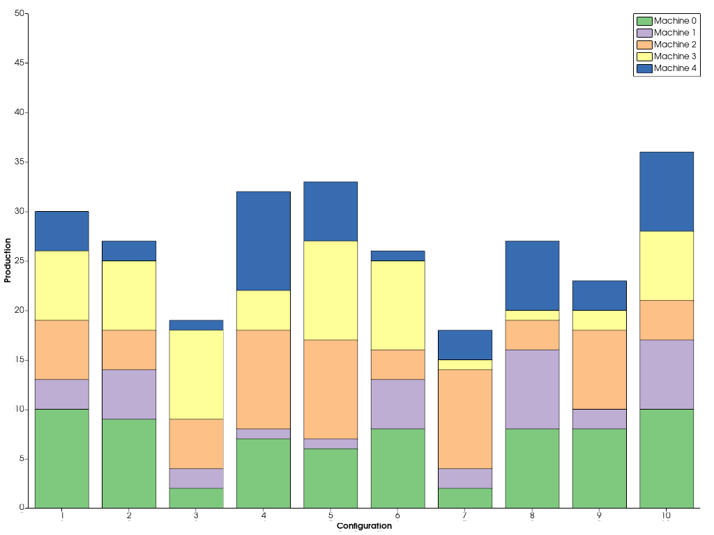
バーを横に並べて描くのではなく,重ねて描きたい場合は,yの値を連続して渡します.
x = np.arange(1, 11)
ys = [rng.integers(1, 11, 10) for _ in range(5)]
labels = [f'Machine {i}' for i in range(5)]
chart = pv.Chart2D()
chart.bar(x, ys, label=labels)
chart.x_axis.tick_locations = x
chart.x_label = 'Configuration'
chart.y_label = 'Production'
chart.grid = False  # Disable the grid lines
chart.show()
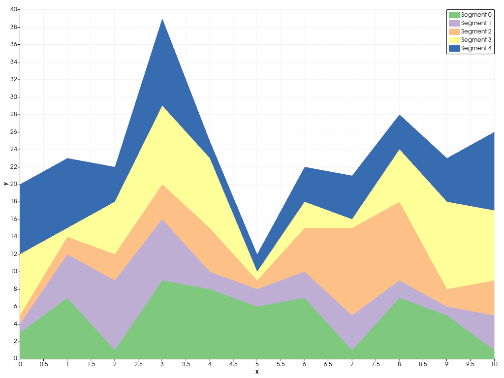
同様に、 stack() を使えば、複数のエリアプロットを重ねることができます。
x = np.arange(0, 11)
ys = [rng.integers(1, 11, 11) for _ in range(5)]
labels = [f'Segment {i}' for i in range(5)]
chart = pv.Chart2D()
chart.stack(x, ys, labels=labels)
chart.show()
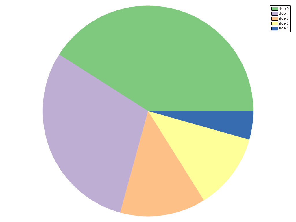
前の例で使用した柔軟なChart2Dの他に、作成できる専用のチャートがいくつかあります。下の例は、 ChartPie を使って円グラフを作成する方法を示しています。
data = np.array([8.4, 6.1, 2.7, 2.4, 0.9])
chart = pv.ChartPie(data)
chart.plot.labels = [f'slice {i}' for i in range(len(data))]
chart.show()
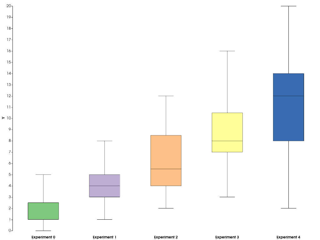
データセットの統計を要約するには、 ChartBox を使って簡単に箱ひげ図を作成できます。
data = [rng.poisson(lam, 20) for lam in range(2, 12, 2)]
chart = pv.ChartBox(data)
chart.plot.labels = [f'Experiment {i}' for i in range(len(data))]
chart.show()
pyvistaやVTKでサポートされていない他のタイプのチャートを追加したい場合は,matplotlibを使ってカスタムチャートを作成し,pyvistaのプロットウィンドウに埋め込むことができます.以下の例は,これをどのように行うかを示しています.
import matplotlib.pyplot as plt

# First, create the matplotlib figure
f, ax = plt.subplots(
    tight_layout=True,
)  # Tight layout to keep axis labels visible on smaller figures
alphas = [0.5 + i for i in range(5)]
betas = [*reversed(alphas)]
N = int(1e4)
data = [rng.beta(alpha, beta, N) for alpha, beta in zip(alphas, betas, strict=True)]
labels = [
    f'$\\alpha={alpha:.1f}\\,;\\,\\beta={beta:.1f}$'
    for alpha, beta in zip(alphas, betas, strict=True)
]
ax.violinplot(data)
ax.set_xticks(np.arange(1, 1 + len(labels)))
ax.set_xticklabels(labels)
ax.set_title('$B(\\alpha, \\beta)$')

# Next, embed the figure into a pyvista plotting window
pl = pv.Plotter()
chart = pv.ChartMPL(f)
chart.background_color = 'w'
pl.add_chart(chart)
pl.show()
Total running time of the script: (0 minutes 1.725 seconds)